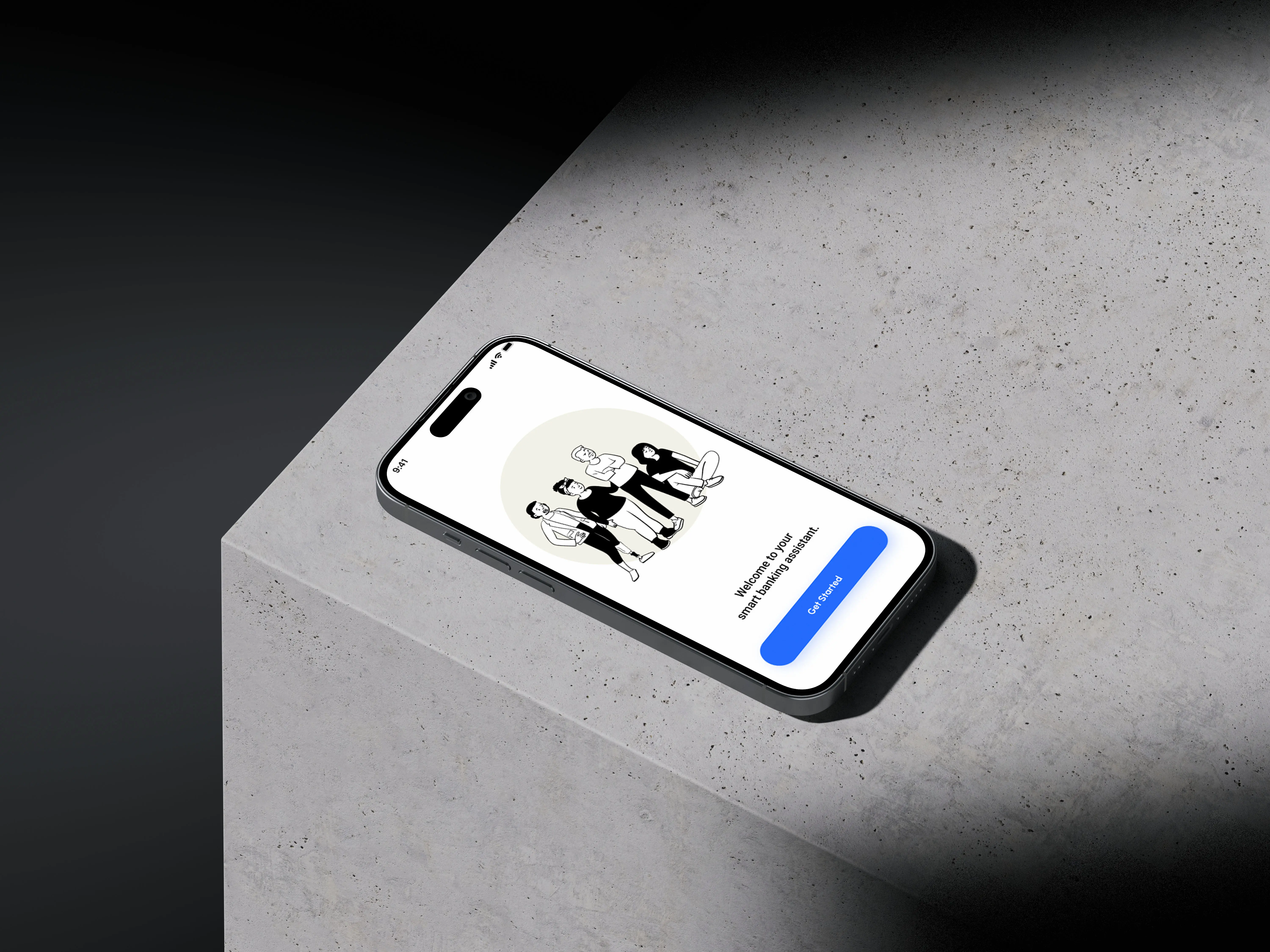
This Smart Banking Assistant app was developed as part of my UX UI Bootcamp project at Vertical Institute. The project brings together core UX fundamentals such as user flows, accessibility, and data security with a clean, modern interface to create an intuitive and engaging way to manage personal finances. It reflects my hands on experience in user research, prototyping in Figma, and designing digital products that solve real problems, making everyday banking simpler and more approachable.
Idea
Here is a tightened, portfolio ready version that keeps the thinking and removes the excess weight, while still sounding human and intentional.
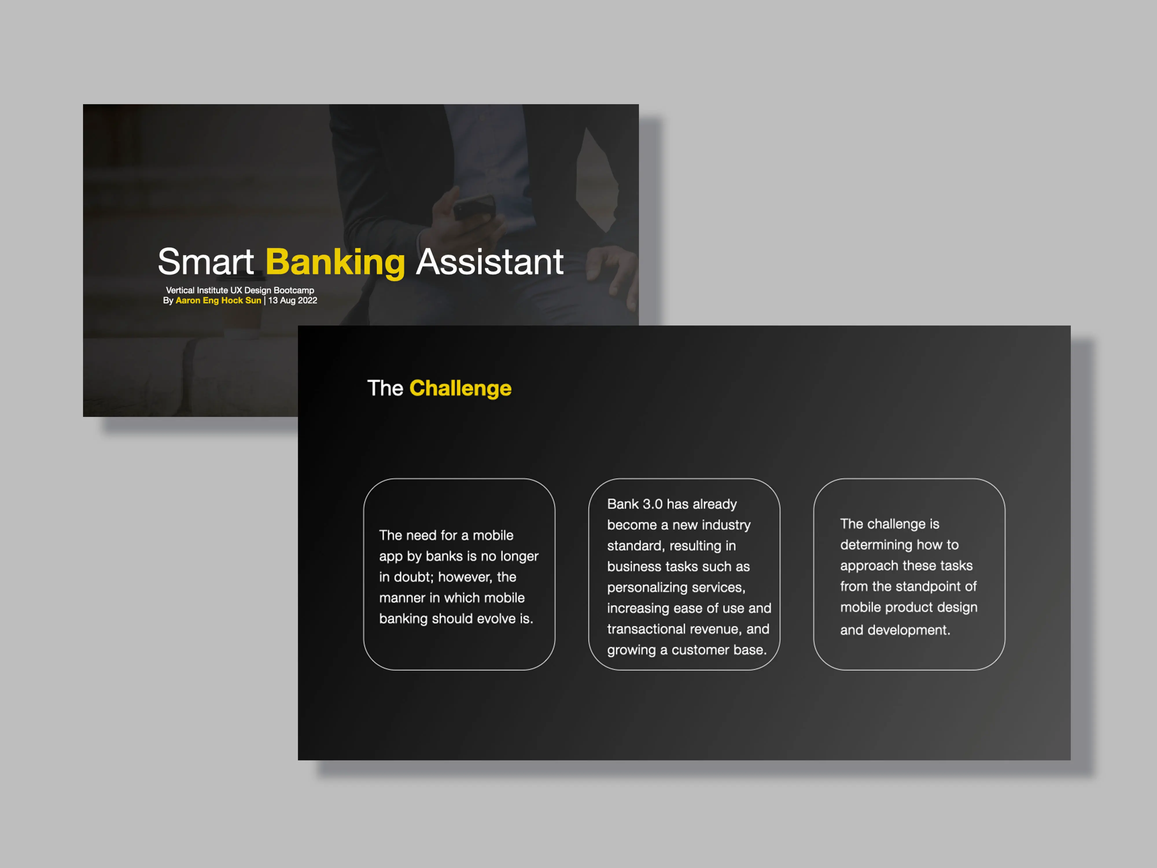
Project Approach
This project followed a user centered design process, applying core UX principles learned during the bootcamp.
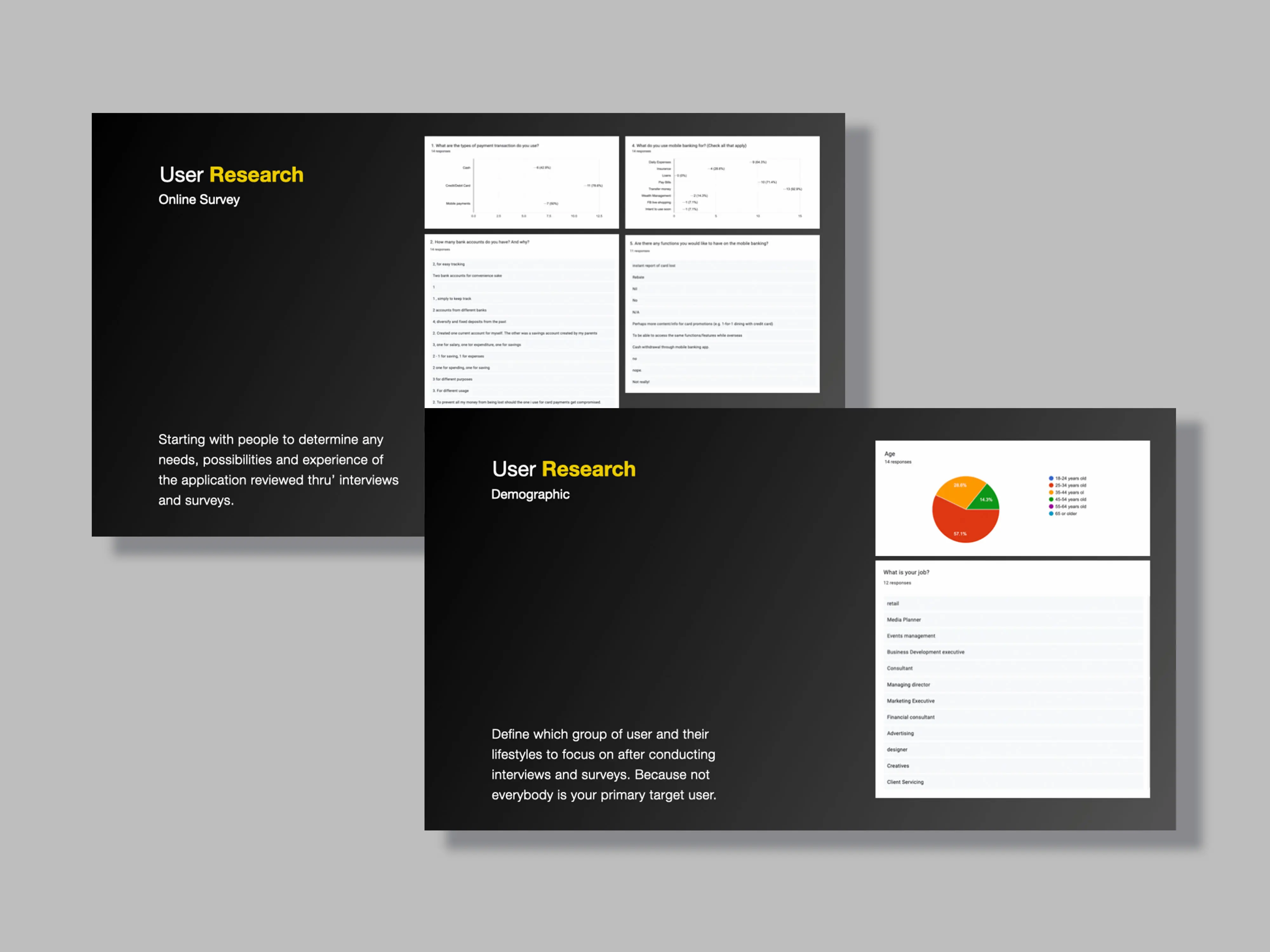
Discovery and Research
I defined key user groups such as young adults managing budgets and seniors who need simple, clear interfaces. Research uncovered common pain points in existing banking apps, including confusing navigation, poor transparency, and difficulty tracking savings. Competitor analysis of apps like DBS digibank, OCBC, and Revolut helped identify gaps and opportunities, shaping features such as personalised insights, goal based savings, and quick bill payments.
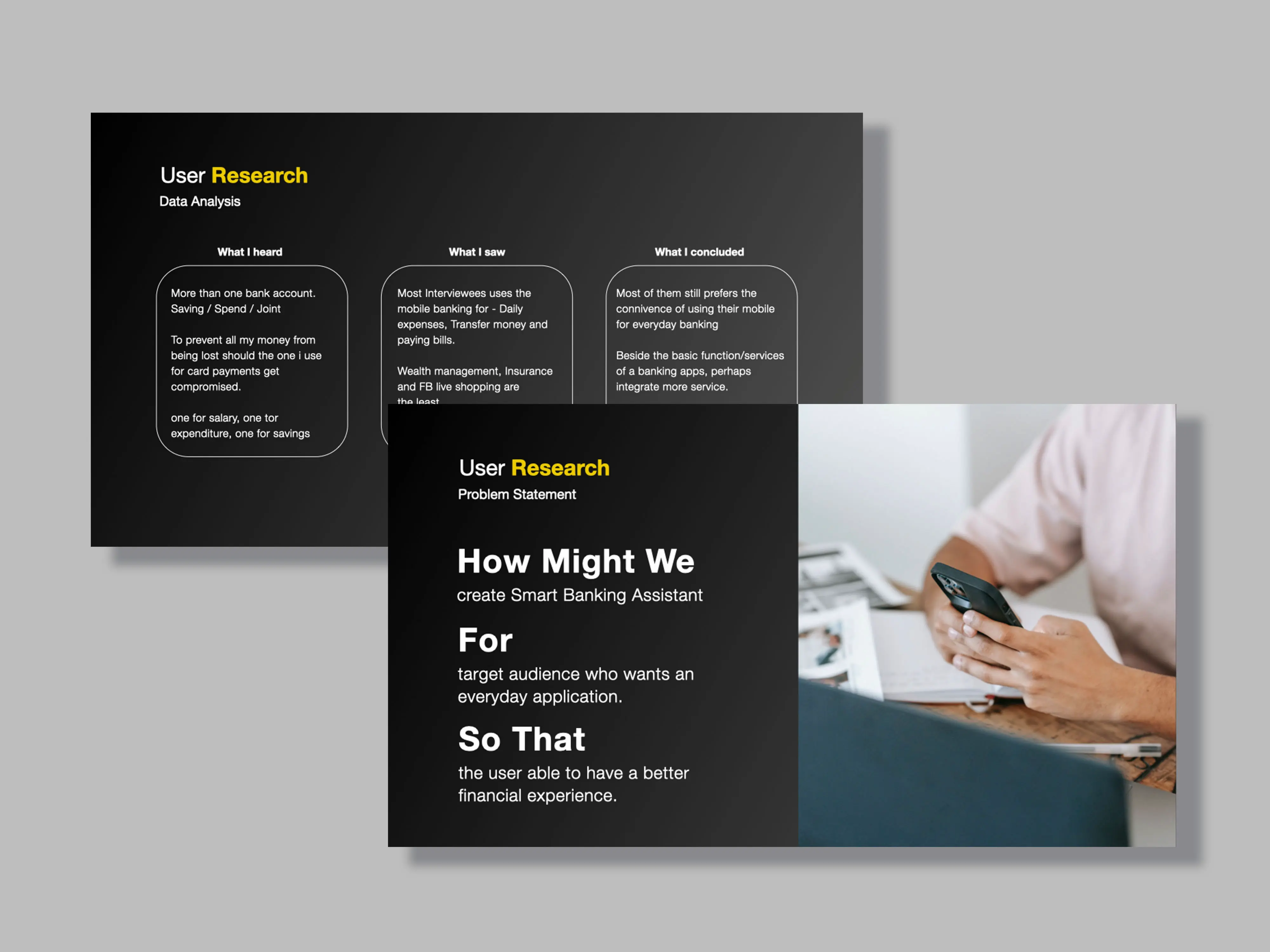
Define and Synthesize
Research revealed that users relied heavily on mobile banking but struggled to manage multiple accounts across different banks. Advanced features were rarely used. What users wanted most was clarity, simplicity, and control. This reframed the problem from adding more features to creating a single, clear experience focused on everyday financial tasks.
The core question became how to design a smart banking assistant that helps users manage money confidently and efficiently in one place.
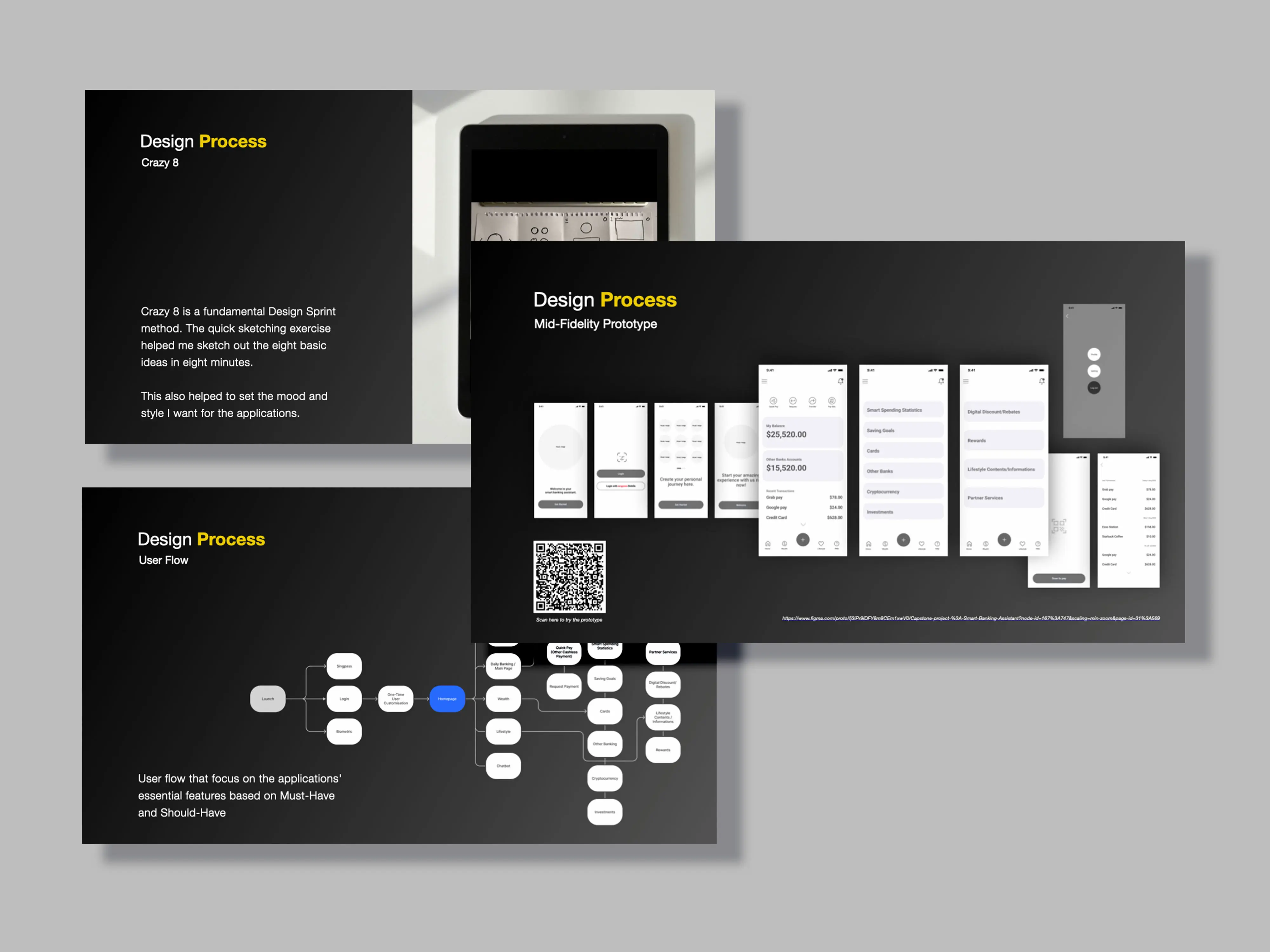
Ideation and Design
Rapid ideation through sketching explored multiple layouts and interaction ideas. From there, key features and user flows were defined around essential tasks like checking balances, tracking spending, and transferring money. Mid fidelity prototypes were created in Figma to test structure and usability before visual refinement.
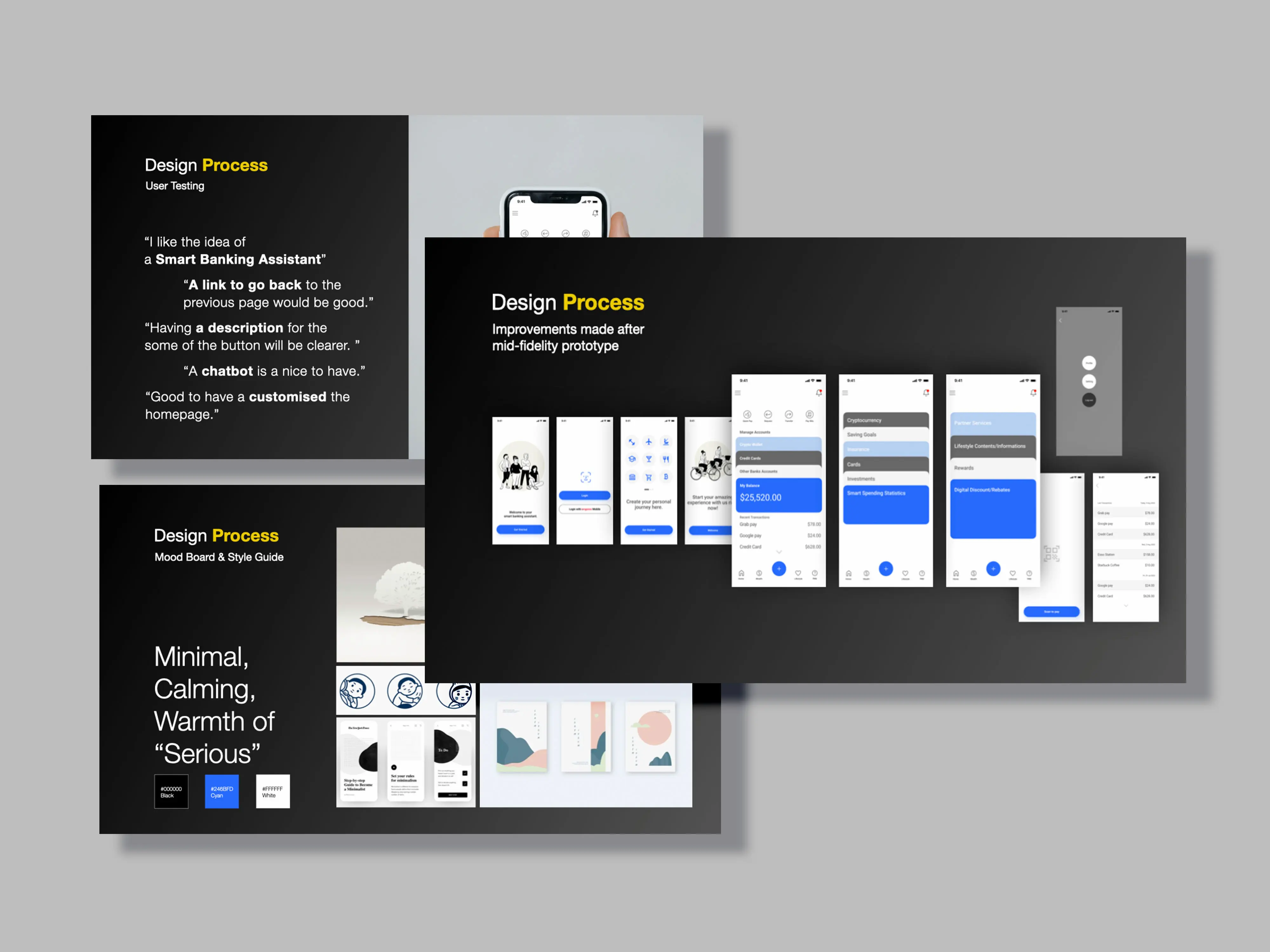
Testing and Iteration
Usability testing highlighted the need for clearer navigation, better button descriptions, and greater personalisation. Users responded positively to the assistant concept and showed interest in customisable dashboards and optional AI support. These insights guided further refinements.
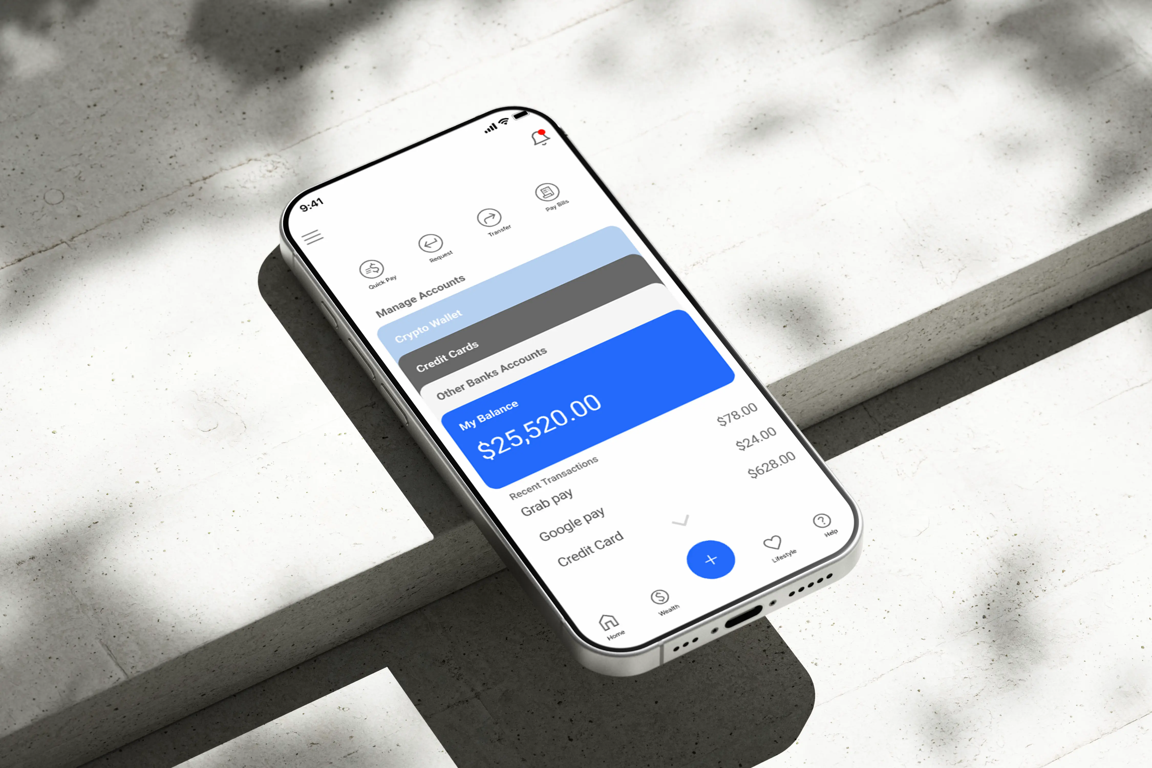
Visual Design
High fidelity designs focused on a calm, minimal, and trustworthy aesthetic. A restrained colour palette and clear visual hierarchy supported readability and accessibility. The final prototype presented banking as an everyday companion rather than a purely transactional tool.
Reflection and Next Steps
This project strengthened my UX skills and reinforced the value of grounding design decisions in real user needs. With more time, deeper research and expanded testing could further refine the concept. Future opportunities include expanding the assistant into a broader omni channel financial ecosystem.
At its core, the project reflects my belief that good UX makes complex problems feel simple, natural, and human.


Outcome